Product design for a much-requested feature
Product Design Case Study
After receiving multiple requests from our teachers originating before joining the company, we decided to explore what a baseline feedback feature could look like if added to the in-classroom product. How would teachers and students be best served with the ability to offer and receive feedback from within the product instead of resorting to other forms of messaging like email, text, or a third-party application?
Brainstorming through sketching
Here are some examples of the groundwork laid by sketching the flow and some significant project points ahead.
Flow
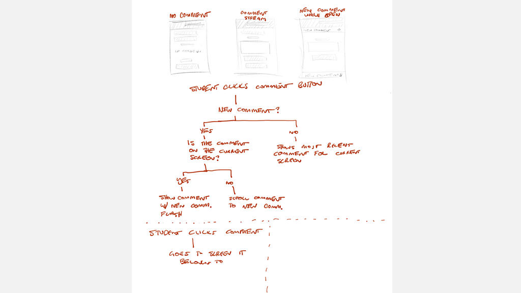
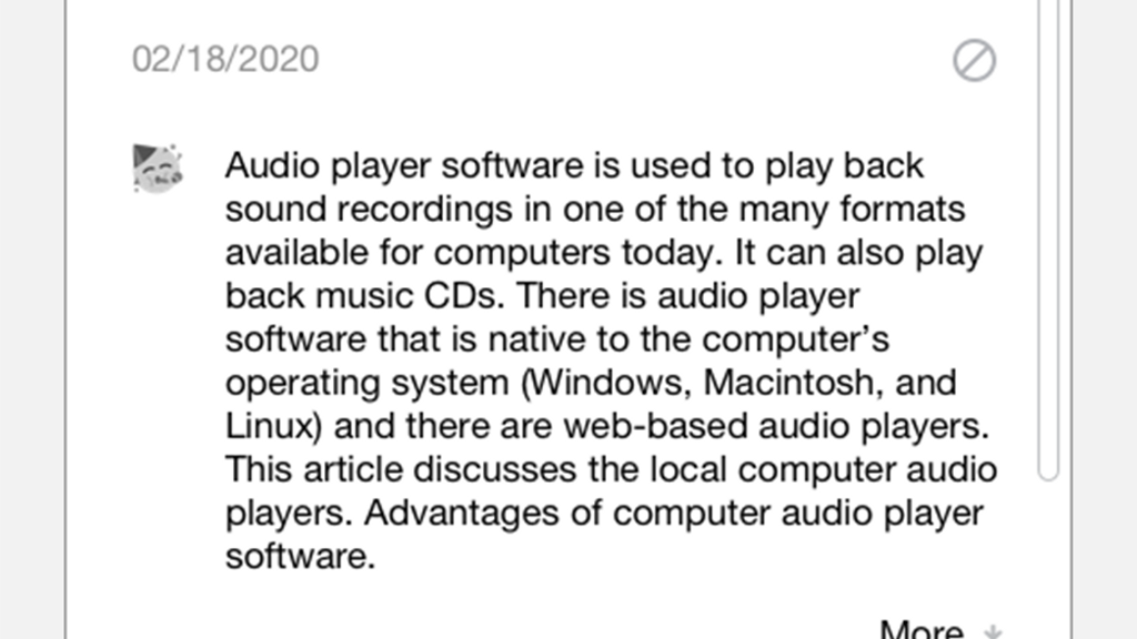
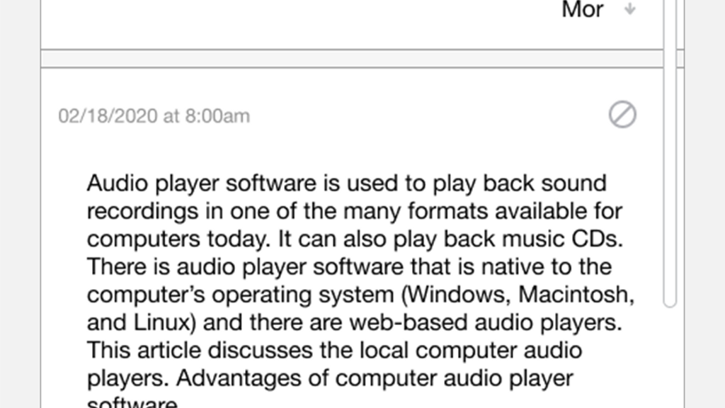
An initial sketch that examines the student-user flow
Message Hierarchy
Getting a grasp on how the stream may look and behave for the student.
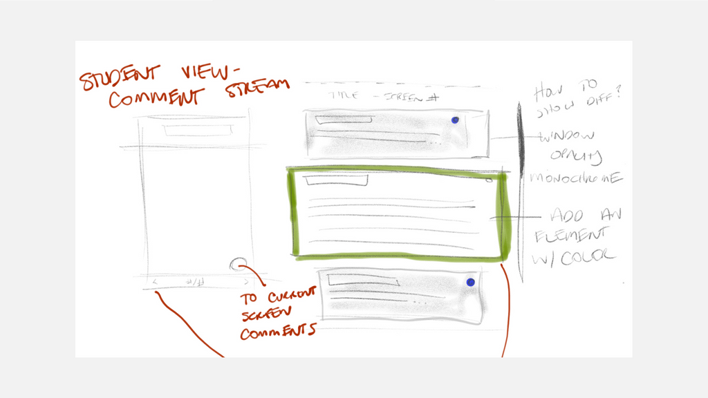
Interaction with the current interface
These illustrate how the lesson content and feedback will share the same space.

Finding the interaction
I wanted to figure out the conversation between the feedback view and the native interface.
A wireframe of the current interface
Lesson content occupies the very center of the screen under everyday product use.
The current interface with feedback
The content will move to the left to create room for the feedback and lesson to share the same space.
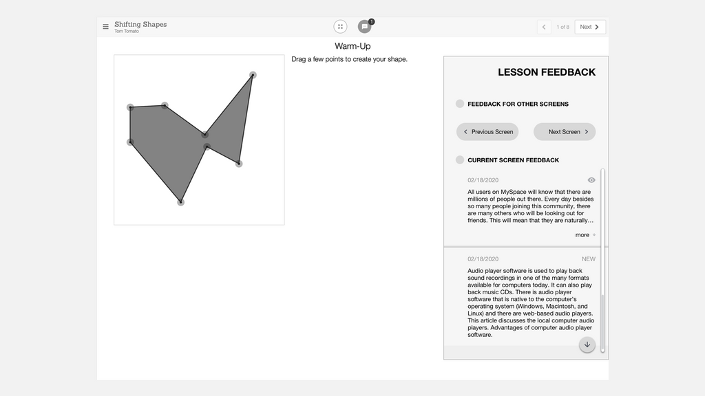
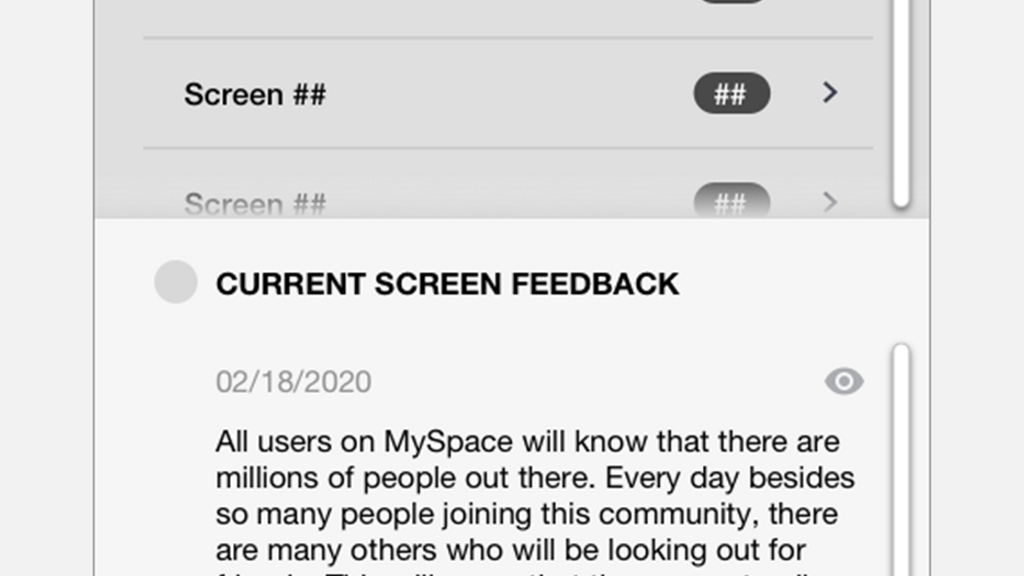
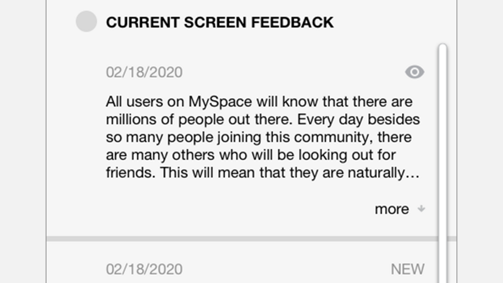
Student Feedback View
v1
Notice how busy and overly complex this is.
v2
With each iteration, the interaction became more streamlined...
v3
and closer to this exercise's goal; an excellent baseline experience.
Student Feedback View cont.
v4 - Near Final
With this version, the messages appear in a time based list with links to the corresponding classwork view.
Teacher Feedback View
v1
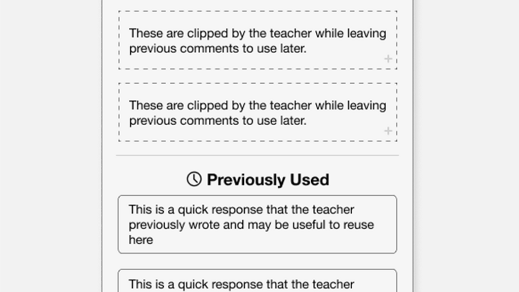
Here, I explored what canned or clipped responses could look like when moving through a more significant roster of students.
v2
Again, further simplification of the interface towards a baseline.
v3
Here, I explored what canned or clipped responses could look like when moving through a more significant roster of students.
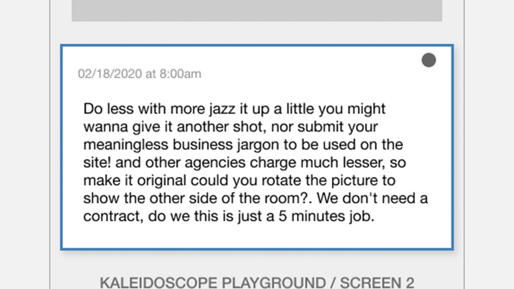
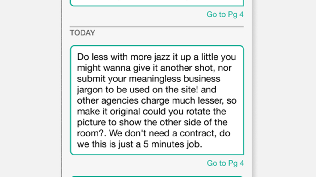
Message Design - Balloons
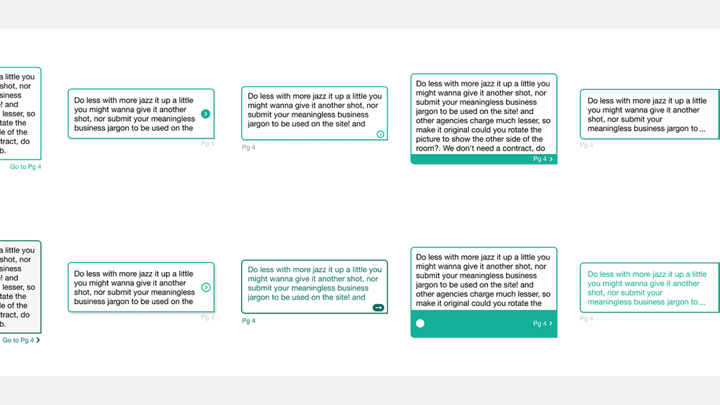
A Selection of Message Designs
I enjoy rapidly creating multiple versions of the UI's important components to make sure I've landed on the best possible option.
Message Design - States
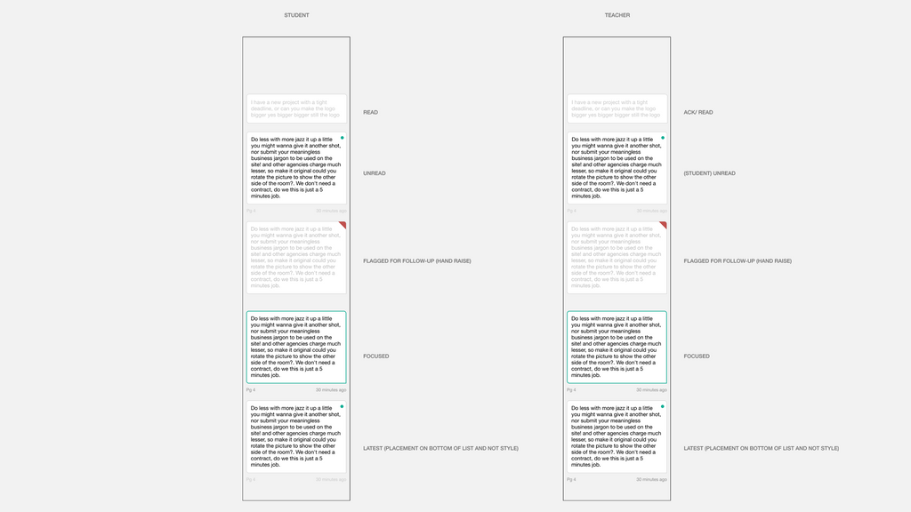
We examined these directions for each potential state for a single message.
Results
The work my team put into designing and building this feature met the goal of creating a fantastic, baseline feedback experience upon which we could build.
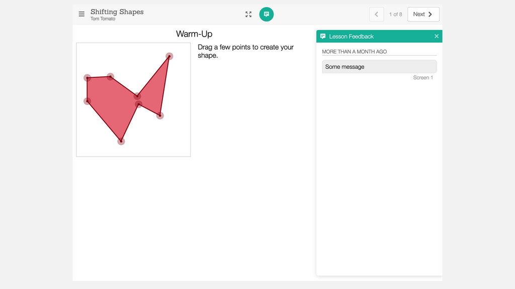
Student - Final
The student is able to view the instructor's feedback next to the work to facilitate acting upon their feedback.
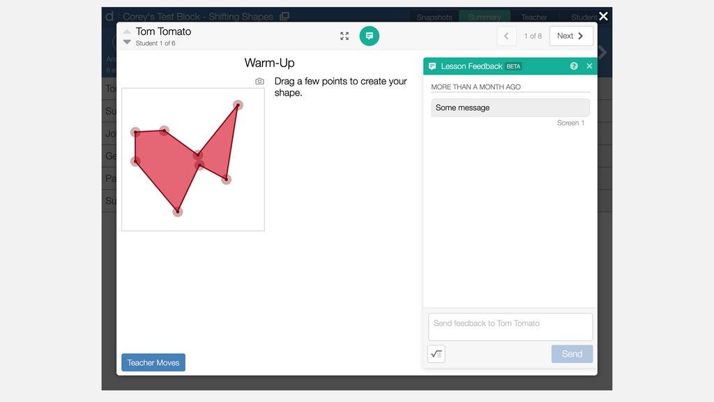
Teacher - Final
The teacher can view the feedback entry window next to the student's work.