Product Design For Broo, a Tea and Coffee Mobile App
Mobile App UI/UX Case Study
If you're a person that loves drinking coffee or tea, you likely go through a ton of beans and leaves. The problem is you can't always remember where you bought that coffee with a black currant/cacao taste or the name of the fabulous green tea with cucumber notes.
Personas
For Broo, I created two personas to cater to. After creating personas to work from, I could move on to sketching out the flow; always keeping them at the forefront of my mind.

Connoisseur
The second persona is more of a novice. Someone that wants to get into the brew game, but may find it intimidating or doesn't generally believe they know what to purchase or how to prepare it.

Aspiring Hobbyist
The second persona would be someone that is more of a novice. Someone who wants to get into the brew game may find it intimidating or doesn’t generally believe they know what to purchase.
A Design Cycle
I performed several design cycle rounds through low-fidelity and high-fidelity prototypes using Sketch (Invison Craft), Adobe XD, and AfterEffects. Below is an example of the progression for the item list view.
Initial sketches for the list view had tea/roast colored squares for navigation with the selected type and flavor notes below.\nThis initial approach wasn't appropriate. It took up the first third of the screen without offering much in return.
Moving into low-fidelity wireframes, I devised separate screens to select the type and the list.\nThis solution could have been more efficient.
Finally, this mockup shows the re-introduction of a single screen. The readable buttons allowed a decision to be made without guessing and saved vertical height.\nThe layout also allows for further item information and the introduction of sorting.
I Ran Into Two Obstacles
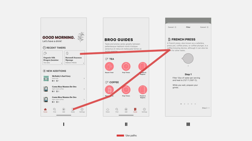
Quickly Getting To Timers
A majority of use was going to occur from repeated use of the preparation guides; particularly the timers. There are likely limited daily opportunities for users to enter new items, but prep happens daily or multiple times a day.\nAfter several attempts, the most obvious solution was to create a “recent prep” button that takes you directly to the correct timer based on previous use. This would get a user to the timer within four taps (opening the app, guide button, most recent prep for tea or coffee, begin).\nUsing a timer on their phone is about the same number of taps, but also requires imprecise scrolling (iOS) or even more tapping to enter the time (Android).\nBroo is also far easier for preparations that contain multiple steps with added timers.
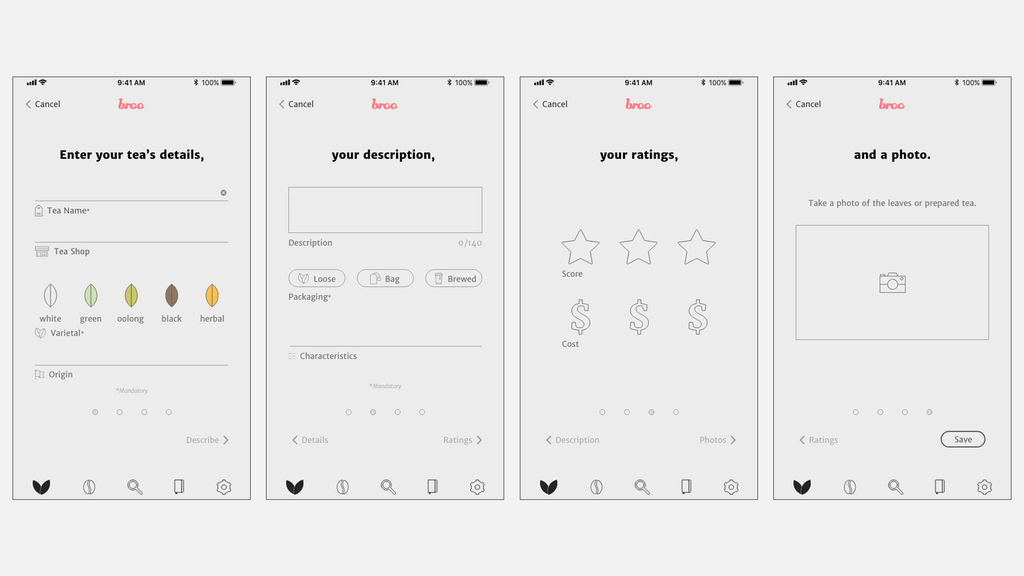
Easy Logging
The original wireframe for Broo had a single page, scrolling form for entering new coffee and tea. It seemed intuitive to have all of the entries on one screen.\nBUT… Following further research, another round of sketching, and a quick and dirty test with a few testers, I came to the conclusion that the best approach would be for a limited number of paginated screens. This would allow for grouping the form elements and increased clarity on where you are in the process and what is expected from you at that moment.
The Designed Product
Once the usability of the app was in the right place, I moved on to experience design. It needed to experience to be simple and clear. I achieved this through a simple color palette. The most significant use of color was in the repeated use of the logo’s pink color to call attention to various elements. The background color for all of the screens was a warm, light grey to avoid blinding yourself with bright white light first thing in the morning. I also wanted the icons to be consistently simple, outline vectors throughout. Simplicity and clarity would allow the user to directly access the right information at the right time. Be it at a crowded tea shop or their own kitchen. The following are high fidelity prototypes displaying several designed states of the final product.
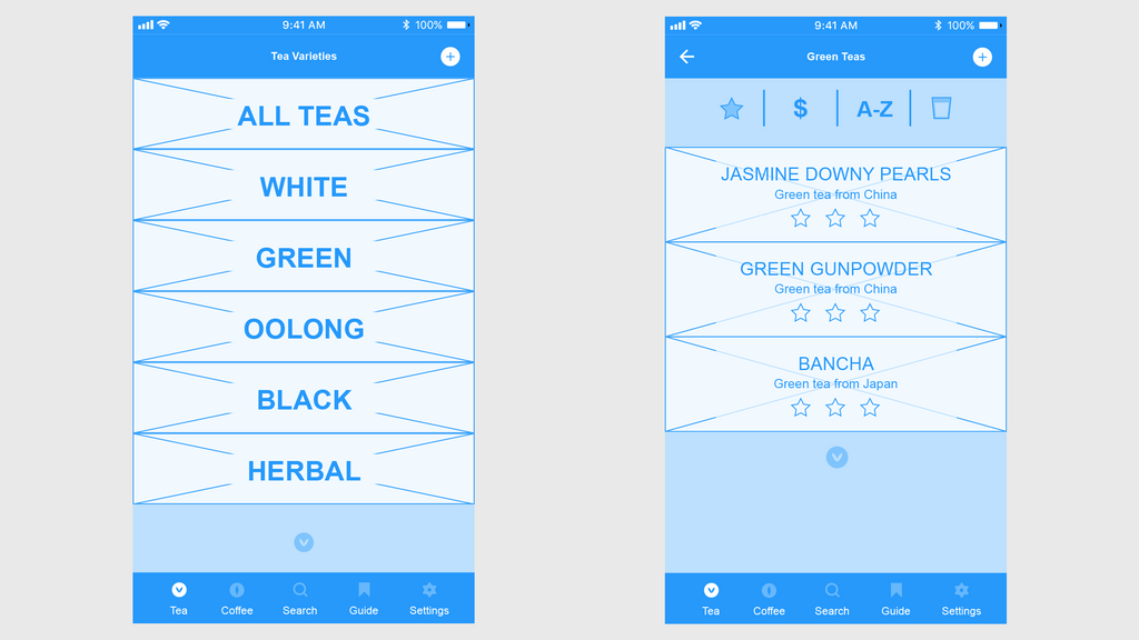
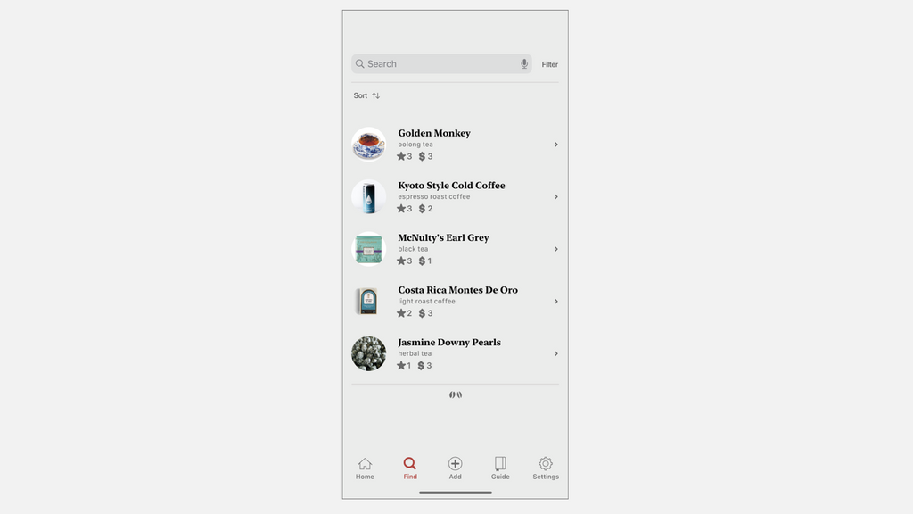
Viewing Your Collection
Seeing your list of entries before you needed to be easy to browse or filter down. Room to present a photo, a name, and other metadata supports browsing.\nThe filters along the top assist in narrowing down to the right item.
Filter & Search
Search will be more helpful with time; for someone that's created an excellent library of beans and leaves for themselves.
Guide
The prep guide was for both the “Connoisseur” and the “Aspiring Hobbyist.” Brew preparation can be remarkably different between apparatuses, making it important to have some assistance with remembering amounts of product to use, water temperature, time, and everything else.\nThe knowledge guide was primarily designed with the “Aspiring Hobbyist” persona in mind. Having a collection of quick explainers of brewing methods, tea varieties, coffee roasts, etc. was vital for on the spot knowledge.