Classified and confidential data has been replaced and/or omitted in compliance with a signed confidentiality agreement.
Web design for "area of influence" assessment
Web Design / Interaction Design
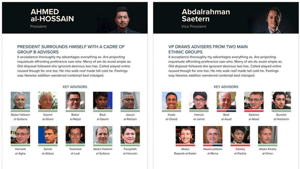
One aspect of understanding how a leader makes decisions is to understand the people that the leader trusts the most. Everything from the number of advisors within the “inner circle” to those members' backgrounds all provides valuable insight into how the leader will respond to events as they arrive. This product was an interactive companion for a written leadership analysis piece.
The Concept
Presenting leadership and their advisors is generally done with static print designs. With this product, the interactivity would allow the author to show that advisor influence was not, in fact, static but a connection that tightens or degrades based on the leader's needs, their trust of specific groups within society, and that advisor's area of expertise. The final interactive product would need to contain collections of advisors based on selected categories and bios for each advisor.
The Hybrid
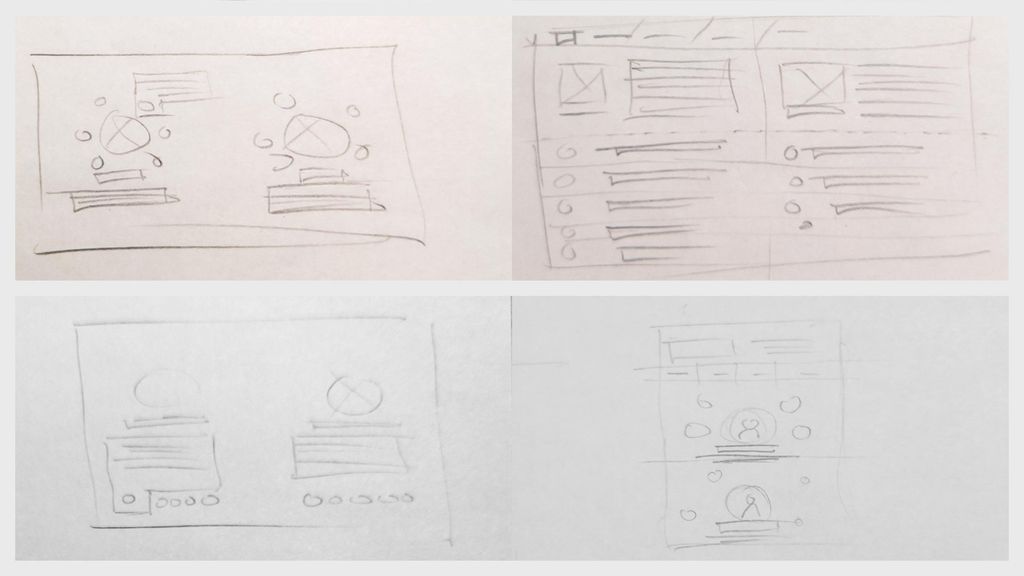
I tried several layouts, including the standard orbital chart, a reordering list, and other arrangements that were better for conveying proximity or a gradient of influence. Since the written product did not focus on the “closeness” of the advisor, I wanted to avoid anything that would appear to portray that.
The Decision
Following several passes and group critiques, the final layout decision would be a morphing tree of advisors that would change through interaction with the product. Since ethnic ties are important in this area of the world, it would be necessary to highlight them.
A Little Surprise
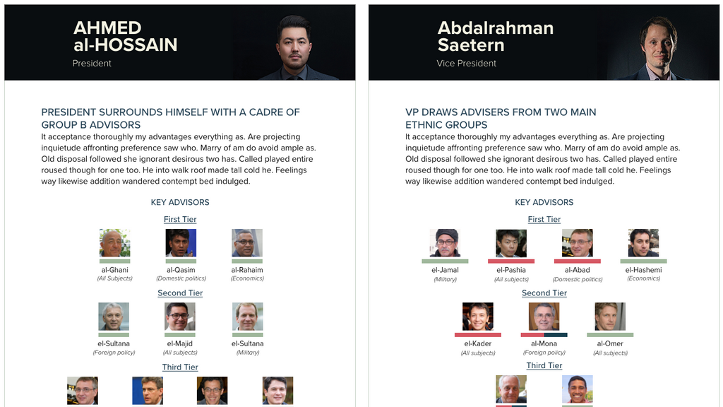
Initially, when a user selected a category, the unassociated advisors would change in transparency to visually deemphasize them. Testing of the final wireframe showed a surprising reaction from several users. Instead of reading it as the person was not relied upon, they understood it as the person being a secondary advisor in those instances but still consulted.

Quick Solution
This feedback resulted in the advisor being completely removed when not needed.
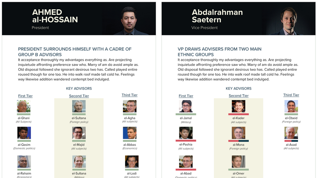
Tiers For Peers

This type of leadership product is typically illustrated through an image that looks much like a circular diagram displaying the solar system. The leader is at the center, with their advisors orbiting around them in concentric circles.
An attempt was made to have the advisors appear in columns. Because all advisors would be present in this view, it took a lot of work to fit them into the limited vertical space of our production requirements.
Organizing the tiers into layers became the most appropriate layout. It created a layout that put more of the content on the horizontal plane and allowed for the introduction of additional information covering the advisor's area of expertise.